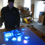
David at Essential
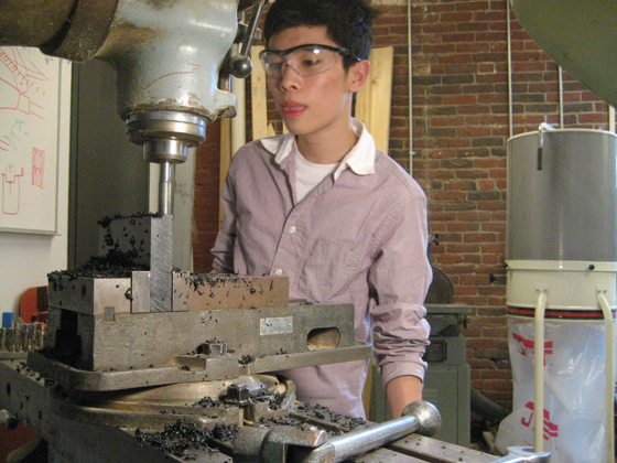
Rough models are made to have a better sense of the product.
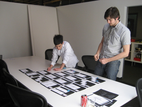
Sketches of the product used in every possible environment.
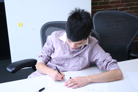
Here I am sketching a product being used in a certain environment.
Notes from David: It’s been really great working at Essential so far. Last Thursday there was a company hike at Mt. Monadnock in New Hampshire. I’ve actually been there before with my family before, but it was just as fun.
I’ve mostly been mostly finding trends and collecting pictures during my internship so far. There’s also a trend wall in the office covered in pictures full of ideas and imagery that gets used in many of the projects with clients. What really interests me about working here is the design process and how projects are fulfilled. Ideas and concepts for projects are usually brainstormed then pinned up on a large board or refined into Powerpoint or Excel. It is interesting to me how ideas for products are based on the product’s function, user, and suggested environment. There’s always a struggle between the size of the product, its accessibility and portability. Cool stuff…
Youth Design Boston visits the ICA
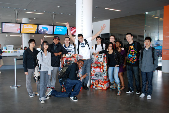
Youth Design at Shepard Fairey Exhibit at the ICA
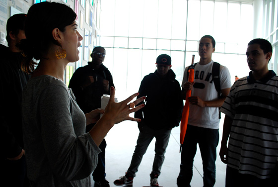
Tara Oremus, Youth Design's Director of Operations, engaging with the students at the ICA
Notes from Tara Oremus: The Youth Design interns spent their first Professional Development session at the ICA to see the amazing Shepard Fairey exhibit. A museum guide gave us a tour of the exhibit, which gave great insight into the show, the work, and what it took to put it up. Then we all spent some time walking around the exhibit, looking at the work more in-depth and watching a video about Shepard Fairey and his work. Before we left, we went to the museum store to check out all of the interesting books and items they have there. It was a great time!
Faith at MetLife

Where I Work

What I'm Working On
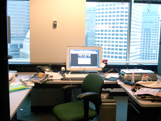
My Workspace
Notes from Faith Zeng: So I’ve been working at MetLife, and a large part of what I do is help the other designers finish their projects. On my first day I browsed the MetLife brand center that’s only available to the designers, and I got a sense of how MetLife markets itself to both have an impact on potential consumers and be aesthetically appealing. There are a lot of meticulous guidelines to be followed, like specific palettes, how the Snoopy trademark must relate to the MetLife logo in size, and guidelines on which stock photos should be picked. There are even restrictions on how the Snoopy image is to be used–the image is not to be flipped, there is no shading, the lines can’t be edited, it can’t be too close to the word MetLife, the colors can’t be inverted, you can’t use any different Snoopy images, etc, etc… It surprised me how creative the designers here can get even with the restrictions, and how attractive the brochures can actually be. They even won an award for one of them.
In the beginning I just watched a lot of lynda.com tutorials for InDesign, Photoshop, and Illustrator, played around with one of the brochures that the designers are working on, and cleaned up the studios and work stations. I’m currently working on research for a project in New York. MetLife occupies a new space in Manhattan, at 1095 Avenue of the Americas, and on the ground level of the building exists vacant retail space. The designers did some concepting around making the space innovative and unique–an interesting opportunity to invite passersby to interact with MetLife and the space itself. The space design would be a temporary measure until it’s occupied. Two of the designers here, Emily and James, came up with some ideas, which they have been asked to pursue from a logistical and cost perspective. Of their ideas, the client went with covering the windows with solid colors from the MetLife palettes, and projecting animations of Snoopy and Woodstock onto the glass that would interact with the people walking by. My job is to find the products and services that could actually make this possible. After my loads of research and extensive googling, I’ve found quite a bit of stuff on rear projections onto glass and colored window tints, and I’m now working on organizing that information in an attractive way in InDesign for the client.
Overall I’m learning a lot, and having a lot of fun with this project!
YDB visits the Improper Bostonian
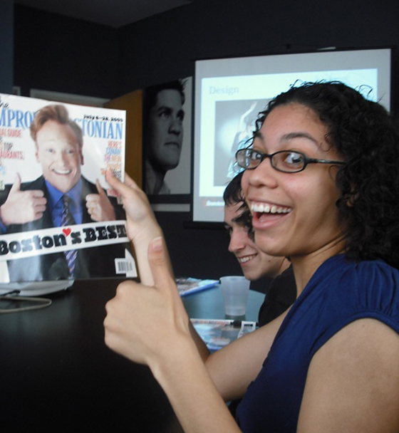
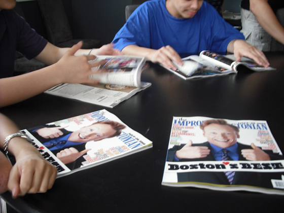

Notes from Kristen Louie + Ben Rukavina: We recently took a trip to The Improper Bostonian. At the offices of Improper, a powerpoint was prepared for us and we learned about working in a magazine publishing office and how a magazine like the Improper comes to be. We learned about the different aspects of design utilized by the designers working for the magazine. It really helped to show the fact that people who do design do all different sorts of work. The designers here were responsible for designing the magazine along with the event coordinating and marketing. The designers talked with us along with the a Writer, Photo Editor, and the Editor. We learned about how long photo-shoots take and the effort that goes into publishing one magazine.
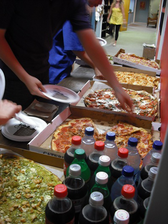
After the presentation we got a free lunch, pizza from their sponsors, Uppercrust.
Experiencing Continuum
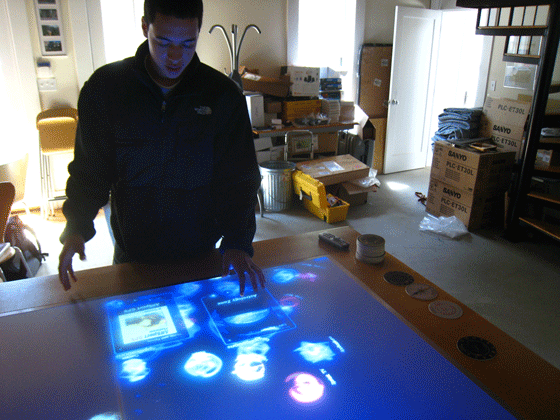
Notes from Joan Abreu: Today is my third day at Continuum, and I have seen some cool stuff in a very short period of time. Definitel it is how I imagined it to be. The people here are very laid back, and they all seem to like what they do. This place is a bit more than just a graphic design studio – that was where I expected to be working. Here at Continuum, there is a combination of graphic designers, industrial designers, architects, computer engineers, product designers, design strategists, and many other talented people.
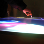
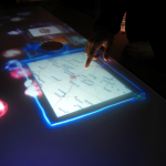
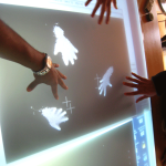
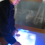
Today Pete and I went to Harvard Square to take a look at some new designs for a touch screen table used in Sprint’s main store in Kansas city. We learned about how the table works, and the technology that is used. Then, afterward, we looked over some ideas for the table’s new look; I actually got to interact with the table using last year’s program. It was very cool!
Youth Design Boston / Summer 2009
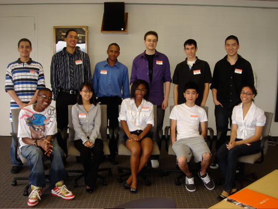
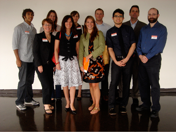
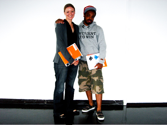
Last week we officially kicked off Youth Design Boston’s 7th summer program! For the first time, all 12 students and mentors came together and met one another. Despite the poor economy, we have more students placed in local studios than we’ve ever had before.
