
Notes from Stacy Arman:
“Fonts!”
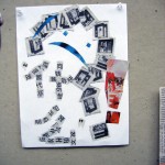
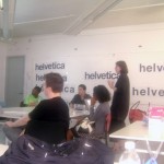
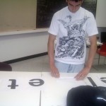
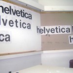
Introduction to Typography was definitely a new experience for most of us. Our 1st project, Kerning, was a little difficult for me. I learned that in typography, kerning is widening or narrowing the space between each letter evenly. Arranging the letters was easy but it was taping them together that I had a hard time with. Overall I saw originality with each intern’s version of the word Helvetica.
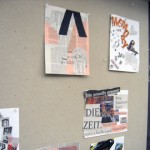
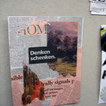
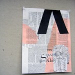
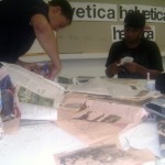
Out second project was using only text from newspapers and a few magazines to create a story on a piece of paper. The text was purposefully all in foreign languages so that we would focus more on the image that a word gives off (for our story) than what the word actually says. This project was fun because I could arrange an image out of typography.